A Total Solution
To initiate the master planning process, we evaluated existing signage around the airport’s perimeter and the roadways in the immediate vicinity. Although the airport had made a number of upgrades to address dated and worn exterior signage—as well as the relocation of air cargo processing, which impacted circulation—they were only piecemeal in nature.

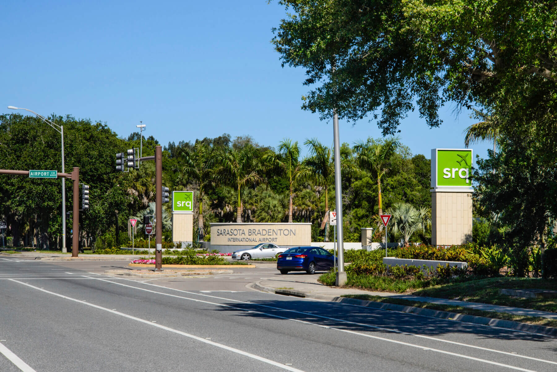
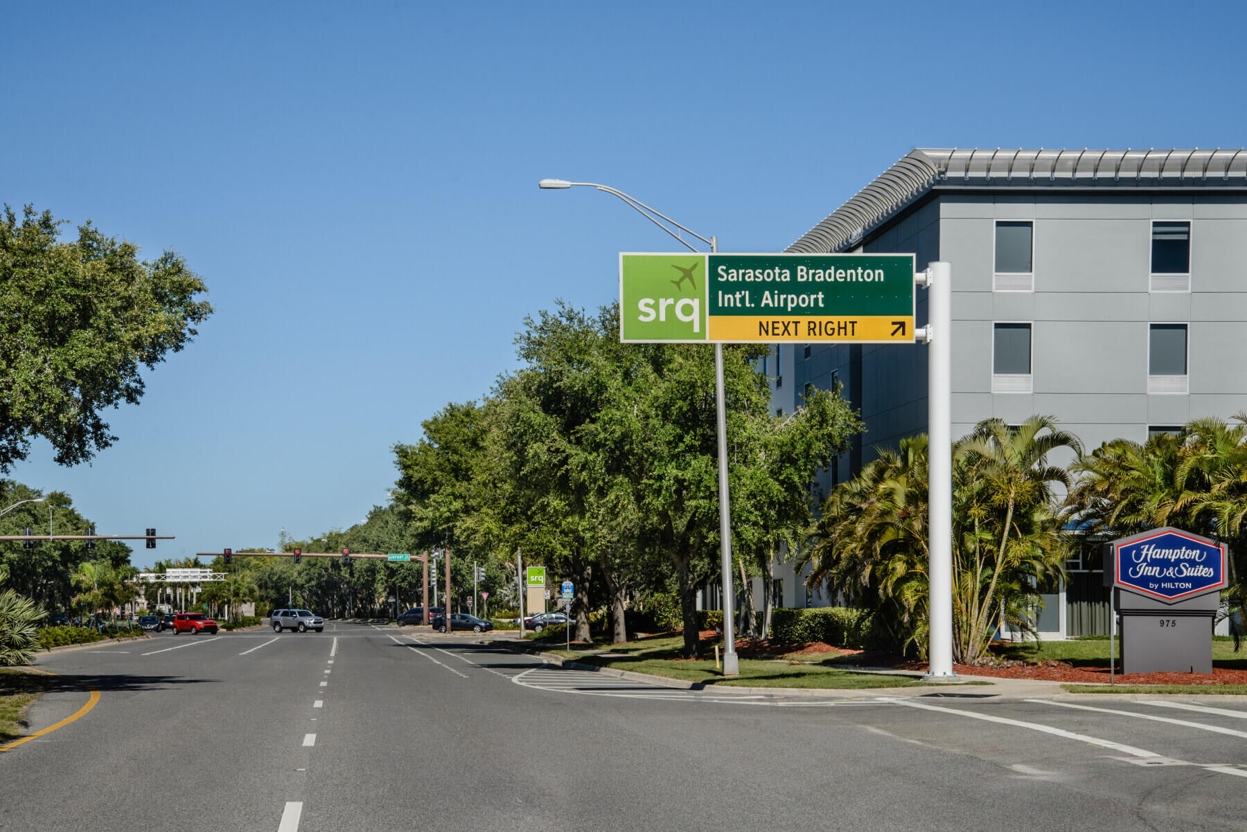
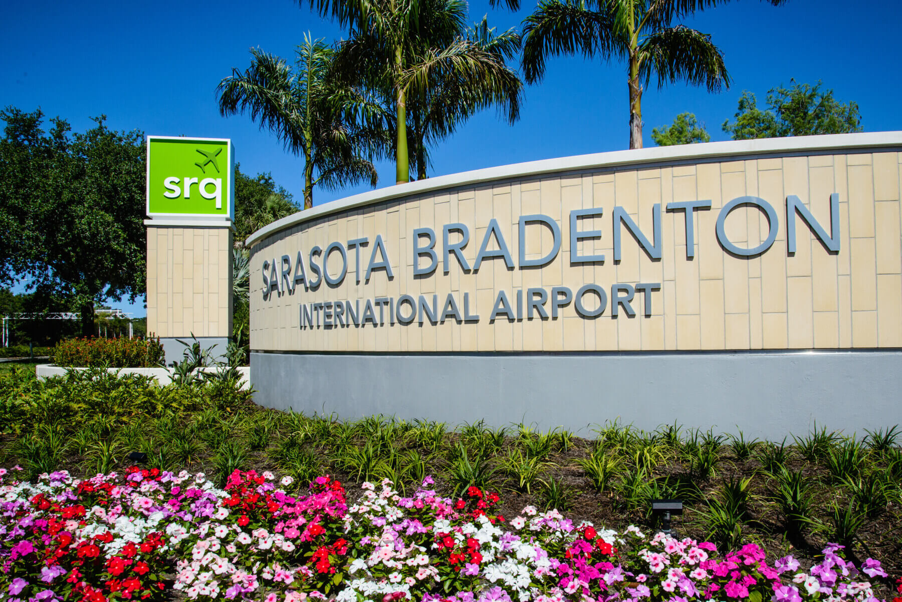
The existing main entrance was easy to miss because of poor lines of sight to the entry sign. The Phase I implementation included a new grand gateway feature that creates a resort-like feel, enhances visibility from the road and provides clearer directions for drivers heading to the airport. We incorporated SRQ’s distinctive logo into both the new entrance monument and directional signage, working with local authorities to gain special permission to include the logo over public right-of-way’s.

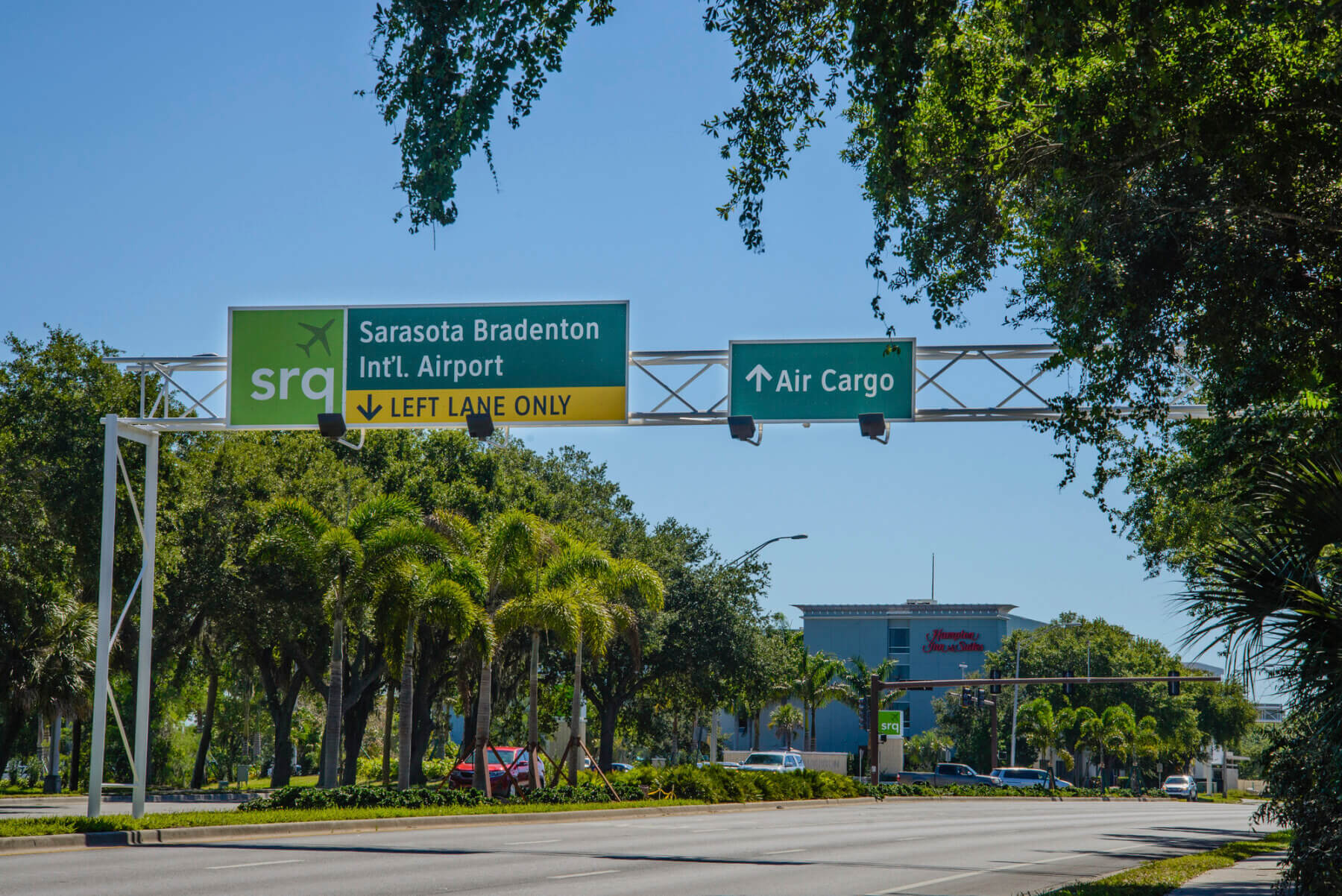
Wayfinding was further complicated by old overhead roadway signs along University Parkway—the main road leading to the airport. The Phase I implementation included a refresh of these aging structures, which saved costs by repurposing the existing signs and reconditioning the timeworn galvanized steel with a clean, white, painted finish.

Currently in the second phase of the project, our team is designing signage improvements for the airport circle loop and the areas to the East and West of SRQ that house support buildings. The airport loop upgrades will address clarity and wayfinding gaps at key decision points. To the East, additional signage will support safer vehicular and pedestrian circulation, including signage and pavement markings to emphasize crosswalks, as well as address changes to ancillary services locations. To the West, we’ll provide better direction for exiting the airport to U.S. Route 41.
