Listening to Customers
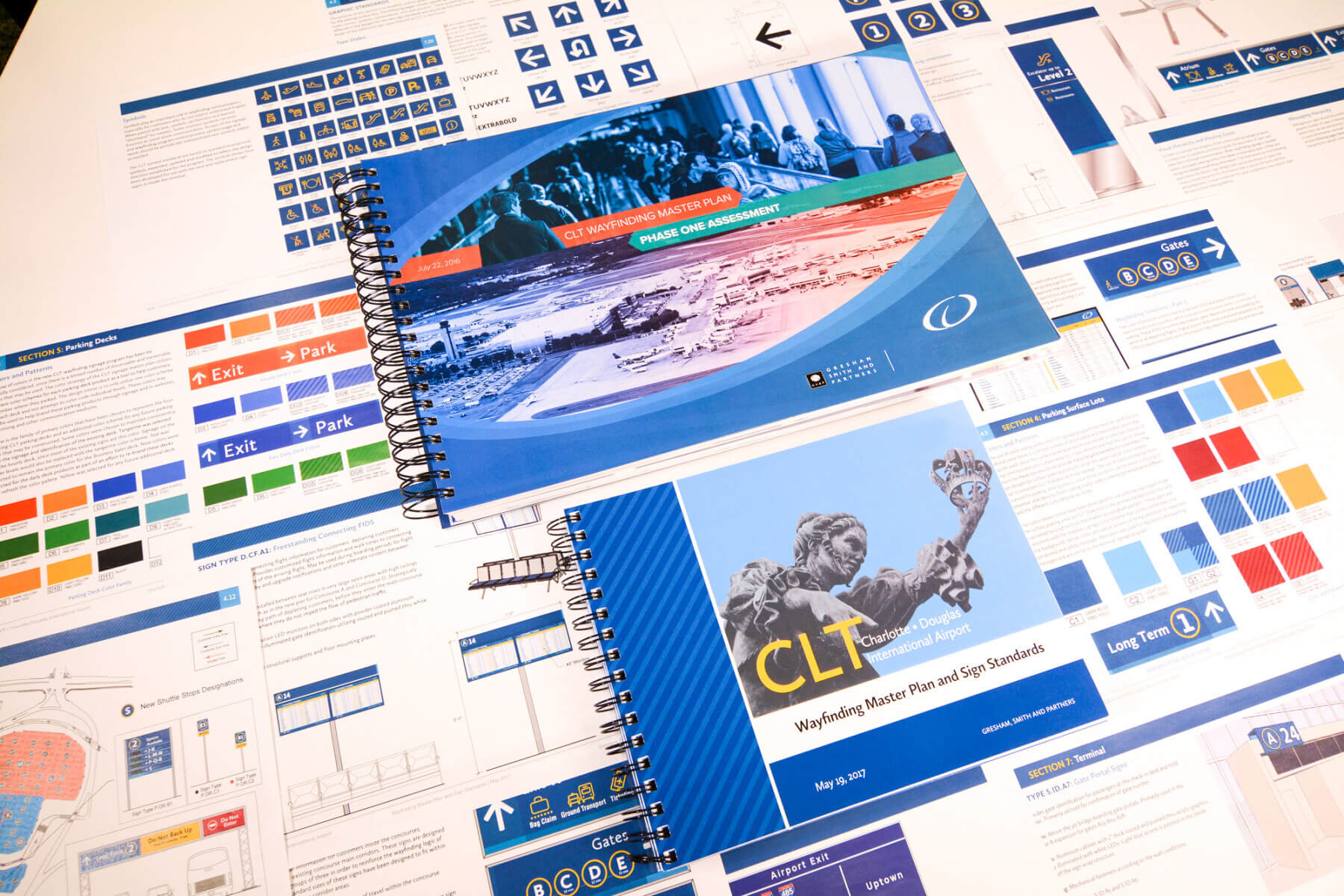
Utilizing best practices identified within the Gresham Smith-authored ACRP Research Report 52: Wayfinding and Signing Guidelines for Airport Terminals and Landside, the master plan serves the needs of departing, arriving and connecting passengers. To better understand these user groups, we surveyed 2,000 CLT customers to determine what mattered most to them when it came to navigating the airport.

A Touch of Southern Hospitality, Charlotte style
Wayfinding plays a vital role in how an airport communicates with its customers. When seeking a wayfinding solution for CLT, the client conveyed their “voice” to us in four simple words: “Southern hospitality, Charlotte Style.” Our signage and wayfinding master plan contributes to CLT’s voice in a number of ways, including a distinctive gingham pattern—or checkered pattern—that serves as a visual reference to the historical textile mill industry of the Carolinas.
A key program design element, the gingham pattern formulates a grid of how information is delineated and organized at CLT for easy comprehension. Along with serving as a graphic device in which signage layout is developed, the unique gingham configuration also adds a texture that creates visual interest.

More Engaging, Playful & User Friendly
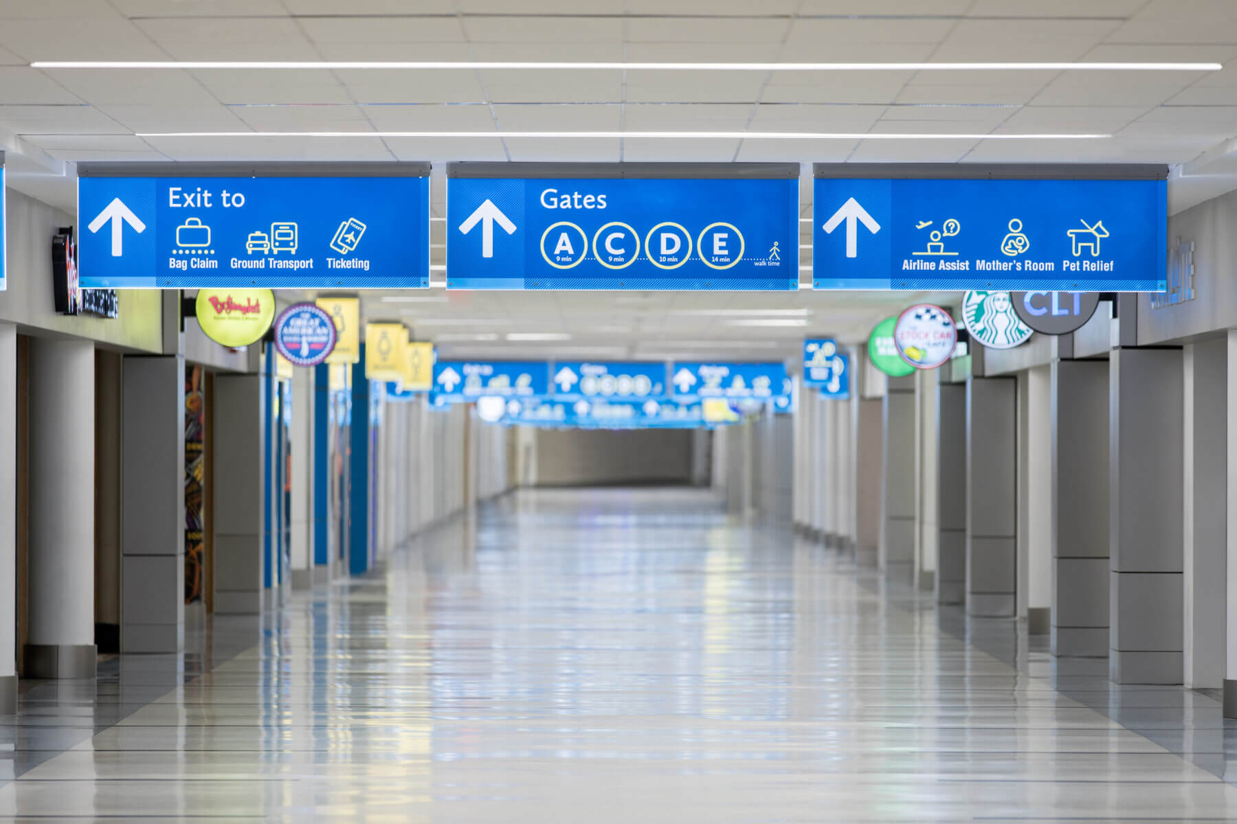
Another way our design extends CLT’s Southern hospitality to its customers is through implementing a new signage font style that’s more user friendly while remaining highly legible. Easy to read from a distance, large international symbols and pictograms featuring warmer and friendlier color tones were also designed to be more engaging as well as playful.
Additionally, a central information center that bundles flight information, airport directories and important airport marketing messages provides a customer-friendly single unit.

Encouraging Repeat Business
CLT is the second-largest American Airlines hub after Dallas/Fort Worth International Airport (DFW), which translates into almost 80% of the airport’s customers being a connecting passenger. Our research, which included 2,000 customer surveys, discovered there is a negative perception among passengers regarding long walk times from gate to gate. Therefore, a key part of the wayfinding solution includes walk times to any gate at the airport.

This Is How We Do It!
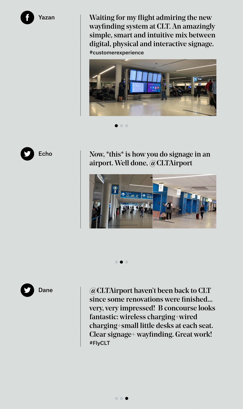
Our design equips travelers with access to airportwide knowledge along key points of the gate-to-gate journey. This has not only resulted in positive customer-experience feedback, but has also helped encourage connecting passengers to make CLT their airport of choice.
Visual Hierarchy
Every airport has visual elements that tend to compete for space and place, e.g., art, advertising, concessions, CLT marketing, retail and wayfinding. Gresham Smith worked with each of the various airport departments to develop a thoughtful strategy to effectively manage these visual elements so they can all live in harmony. Examples include dedicating space next to FIDS and directories for CLT to share important messages with customers.
Advertising messages are important because they generate valuable airport revenue. Conversely, while art may not generate revenue, it can be both memorable and inspiring. For this reason, the wayfinding master plan also identified the best locations for landmarks and works of art such as “INTERCONNECTED” by Refik Anadol—a distinctive digital artwork that dramatically portrays the hidden troves of operational data at CLT.
