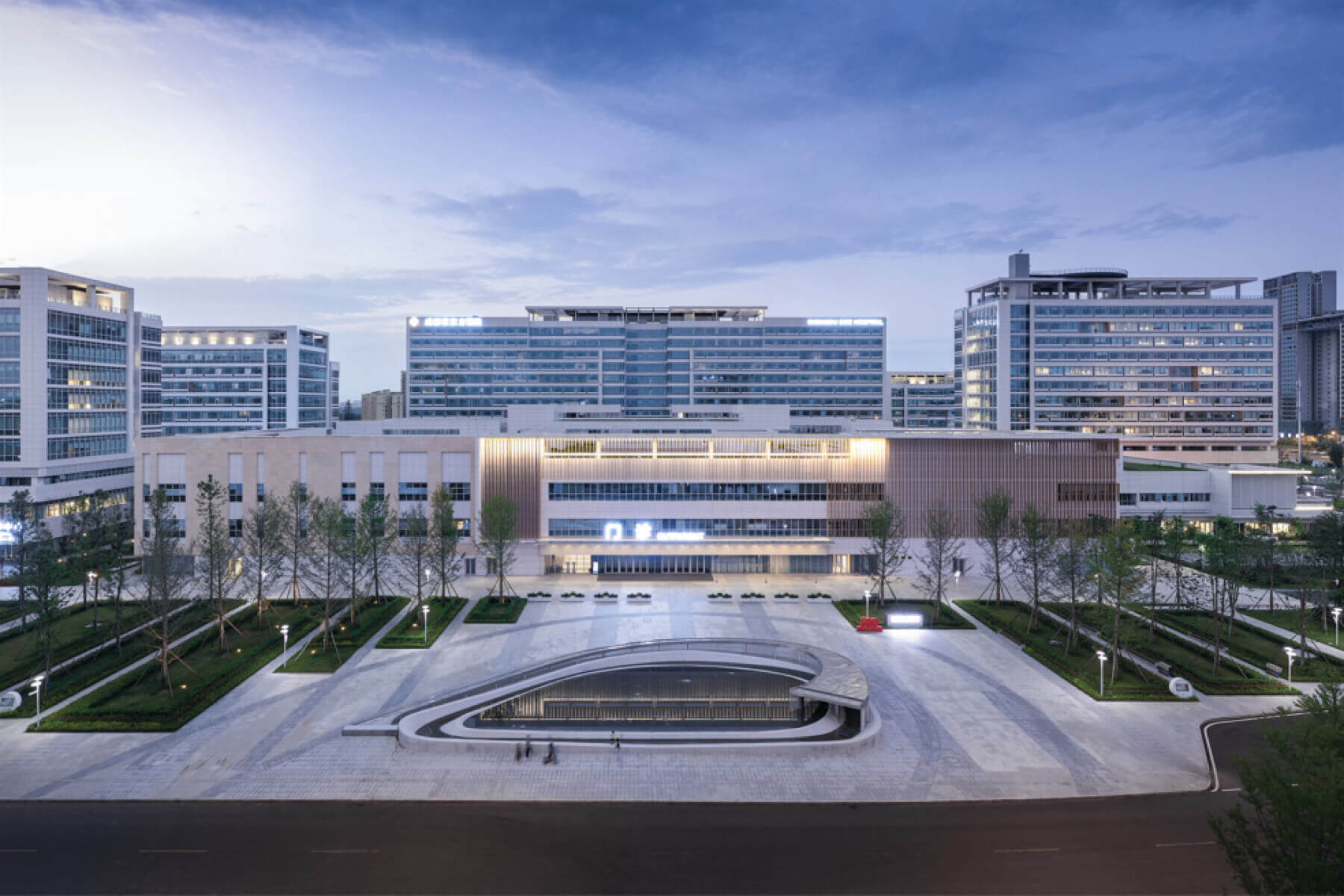
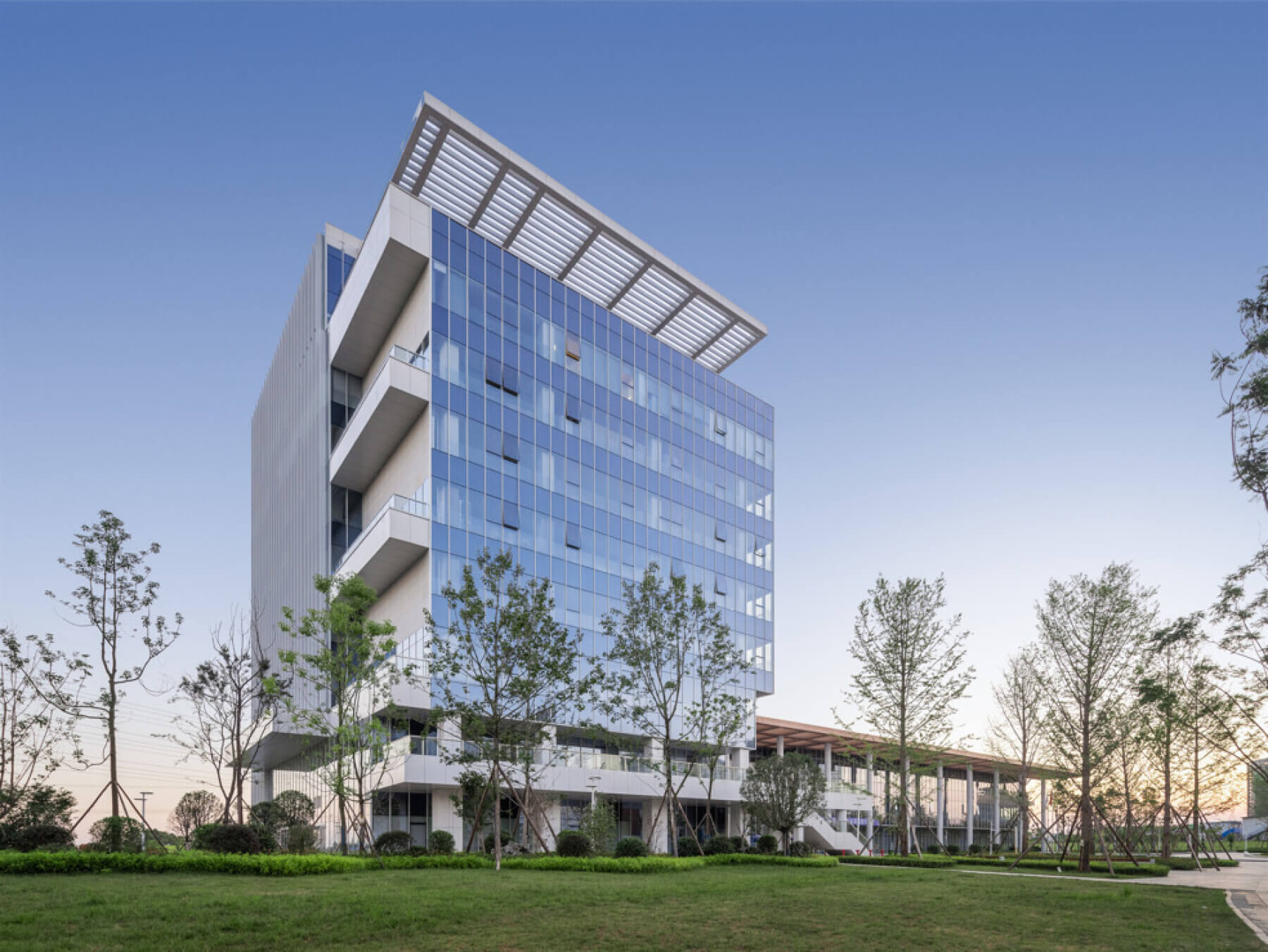
On the exterior of the hospital’s buildings, a light-colored stone accented by metal panels portrays a simple, but modern high-tech image. Vast expanses of windows create a sleek, uniform look and capture as much natural sunlight as possible. Outside the building, an abundant number of outdoor gardens, including green rooftops, were placed at differing levels, offering patients views of lush greenery and places of respite.

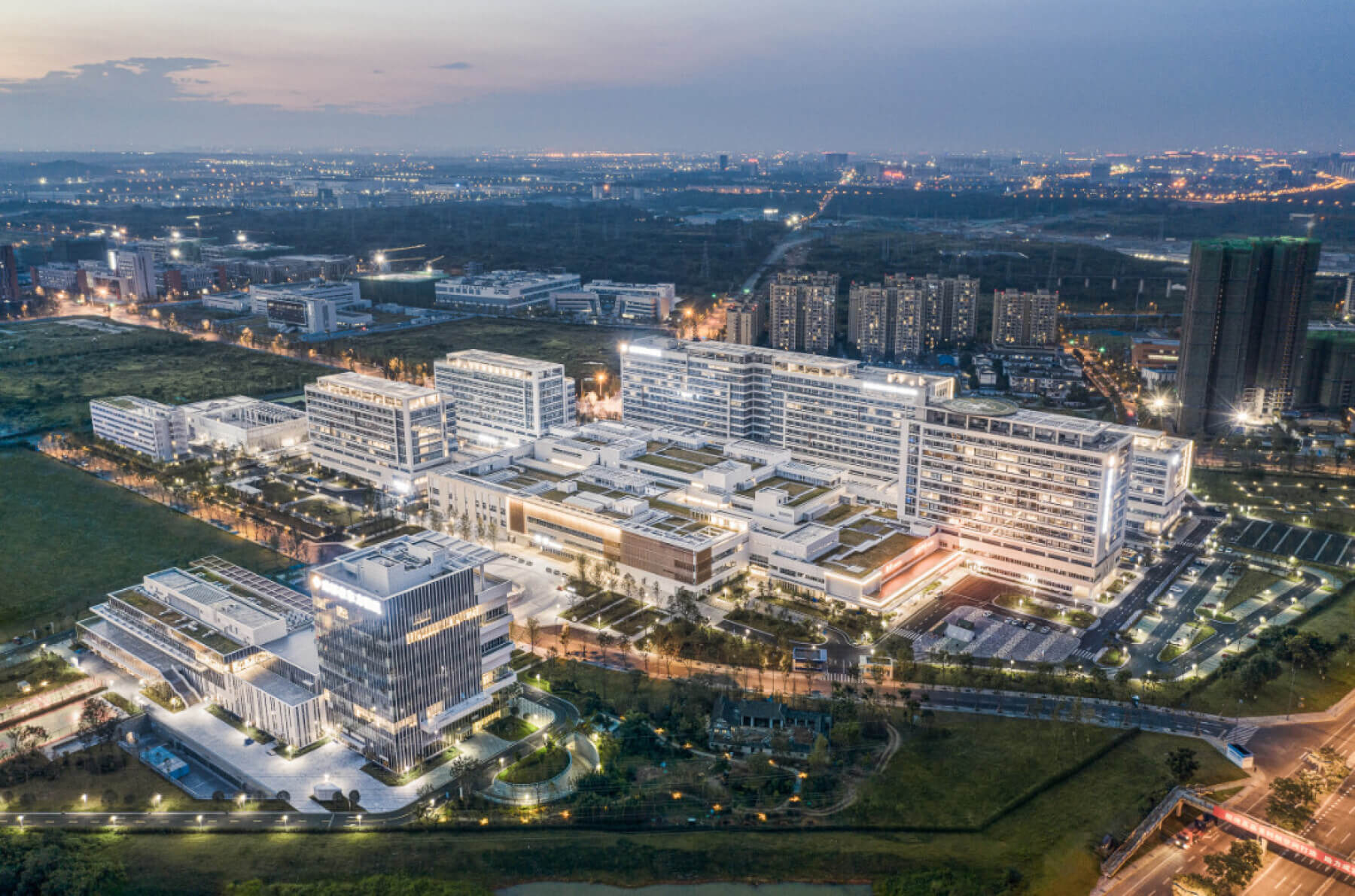
To manage their 2,000 daily inpatients and 6,000 daily outpatients, as well as the 600-emergency department visits a day efficiently, the design team placed a shared diagnostic/treatment resource center directly in the middle of the campus. The resource center is connected to the hospital’s other buildings through a system of corridors and sky bridges. Using an airport-inspired drop-off system, the main road leading into the hospital brings vehicles directly to the shared use center, which includes several drop-off lanes that allow simultaneous car queuing to prevent traffic backups.

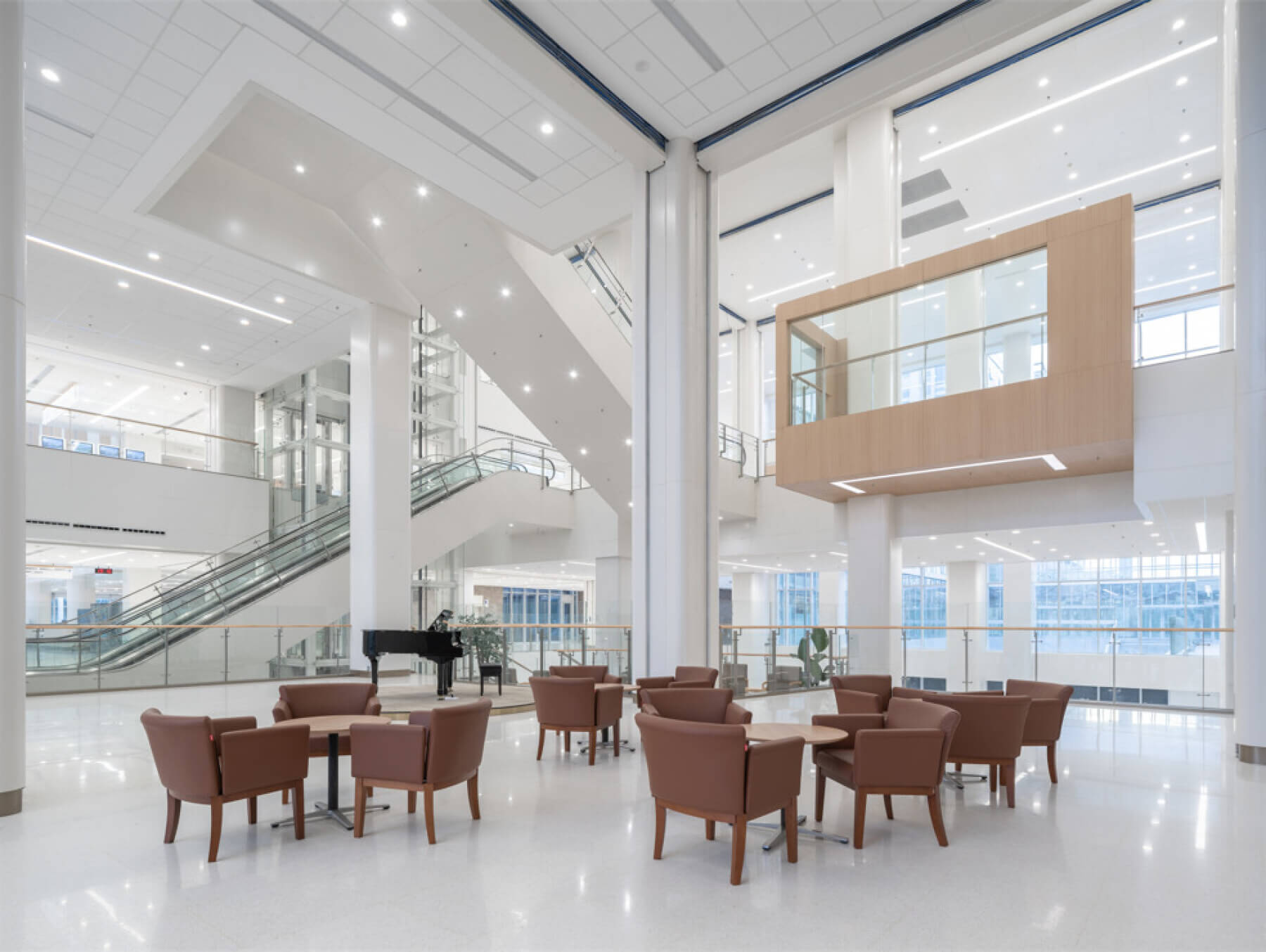
It was important to BOE that we provide a home-like feel for patients and their families to reduce stress levels. This meant making hospital operations and staff spaces out of sight and out of mind so they won’t disturb the healing process. Automated guided vehicles inconspicuously move supplies between the six patient towers and an above ceiling box system further helps with material management. In addition to defined horizontal circulation, the campus also employs separate vertical circulation in key locations to separate visitors, staff and operations.

For its architectural and structural systems, the hospital used several prefabricated components, reducing the amount of embodied carbon produced by its’ construction and eliminating waste. High-efficiency LED lighting and plumbing fixtures throughout the facility reduce energy use, and all of the interior finishes, including the flooring, were selected because they contain a the high amount of recycled contents.
